HSBC Motion Toolkit
UX, UI and Motion - HSBC

TL;DR
A motion design system built to bring consistency, clarity, and purpose to animation across HSBC’s digital platforms. From easing curves to animation durations, from documentation formats to sequencing patterns, this toolkit gives designers and developers a shared language to work with motion at scale. First of its kind at HSBC, and fully created by me.
-
A: Motion Toolkit is HSBC’s first-ever motion design system. I created it from the ground up to define how animation and motion should function across our entire digital ecosystem—mobile apps, web platforms, and internal tools. Until this point, there was no unified approach to motion at HSBC. This toolkit establishes the foundation, covering everything from easing curves and durations to accessibility and documentation, so teams across the globe can design with consistency and clarity.
-
A: I was responsible for every part of the project from early research to final delivery. I began with an internal audit to understand existing gaps, then explored external systems like IBM’s Carbon, Google’s Material, and Adobe’s Spectrum to benchmark best practices. I also drew on in-depth resources like Animation in Design Systems by Val Head. Based on those insights, I built the entire toolkit myself, defining the motion principles, creating animated examples, stress-testing building blocks, and documenting everything in a way that was usable across teams and platforms.
-
A: One major challenge was the lack of a shared motion framework; every animation was being manually built by dev pods, one by one. I proposed using tools like Lottie or Rive to streamline this, but until that’s adopted, I focused on creating a robust documentation method as a second-best solution.
Figma was another limitation. While it’s accessible, it doesn’t support complex timing or multiple transitions. I deliberately avoided heavier tools like After Effects to keep things usable for UX/UI designers. Instead, I created motion specs using text, charts, and visual prototypes so designers could still deliver meaningful animation without needing to be motion specialists.
-
A: The sheer scope of it. Motion toolkits are complex by nature; they touch design, development, accessibility, and system thinking all at once. Taking this from concept to delivery entirely on my own was a huge challenge. While it may not be as expansive as something like IBM’s Carbon, it’s a highly practical, scalable system that brings real structure to how motion is approached at HSBC. It helps teams move faster, stay consistent, and think about motion not as decoration but as a meaningful design tool.
My Role
I led the creation of the motion toolkit from start to finish.
That included an internal audit to identify gaps in how motion was being used across HSBC’s digital products, followed by extensive research into industry-leading systems like Google’s Material, IBM’s Carbon, and Adobe’s Spectrum.
I defined the motion principles, mapped out easing curves and durations, and built reusable patterns that align with our design system. I also created animated examples, developed a clear documentation method for handing motion off to developers, and designed everything in a way that makes motion approachable, even for non-motion designers.
The Challenge
At the time, motion across HSBC’s products was being implemented manually—built from scratch by development pods, with no shared guidance. There was no system in place to help designers define motion or for developers to build it consistently.
While tools like Lottie or Rive could offer a scalable solution, we weren’t there yet. Although After Effects provides more control, it wasn’t practical for everyday design teams. I needed to create a system that worked within real-world constraints—using Figma as the starting point—and still gave teams a reliable way to define, document, and deliver motion.
What It Covers
Motion building blocks
The foundation of the system: durations, easing values, and effects, designed to work together in a reusable way.
Component examples
Practical patterns for UI components like dropdowns, cards, modals, loaders, and banners, ready to plug into real products.
Sequencing & choreography
Load order and spatial flow rules to guide user focus and reinforce content hierarchy.
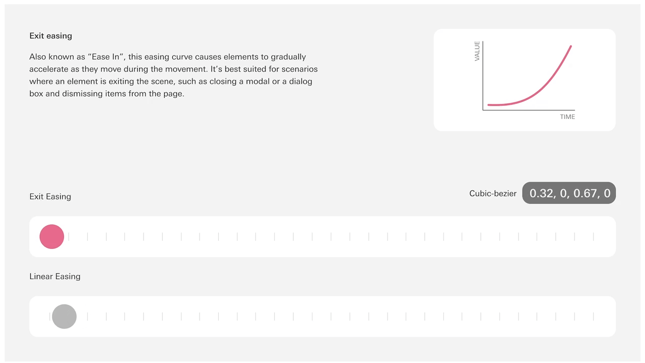
Documentation methods
Two spec formats: simple text for lightweight handoff, and visual chart specs for multi-step, choreographed motion.
Animated illustrations
Guidelines for animating branded graphics, with tips on layering, sequencing, and what should (or shouldn’t) move.
Accessibility support
Built-in support for reduced motion, common practices, and alternative animations for sensitive use cases.

Motion in Action


Onboarding, Logon and Success animations.


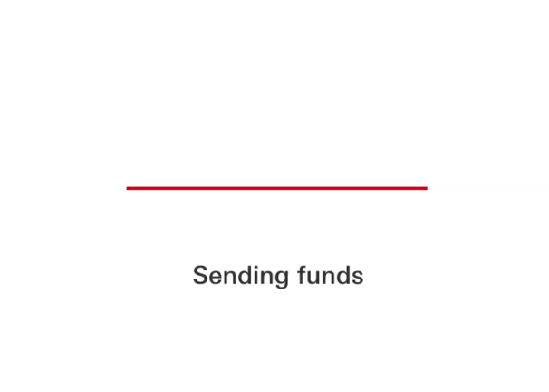
Utilities such as errors, loadings, spinners and notifications
Explore the full toolkit
The system includes a wide range of patterns—from component-level animations to branded illustration guidance and sequencing logic.
You can explore the full interactive toolkit, including motion specs, animated examples, and documentation templates, in Figma’s presentation mode: